Clara for Daters
How we made online dating suck a little bit less.
My role
User Research
User Interviews
Wireframing
Screen Flows
Visual Design
Interaction Design
UX Copywriting
Year
2022-2023
Platforms
Mobile iOS
How do we know if the connection is real?
Anyone who is in the modern dating field can tell you - online dating can be a total drag. From ghosting to apathy to true dating horror stories, it’s enough to discourage anyone from finding real connection - let alone an aligned partnership.
Clara for Daters - launched in February 2023, is an intentional journal and dating coach companion. It is founded on the belief that the person(s) you choose to be in a relationship with impact your mental, physical, and emotional well-being as much as any other life decision.
I was hired in September of 2022 to invigorate and re-imagine the original proof of concept designs, and accelerate the launch of Clara’s beta app.
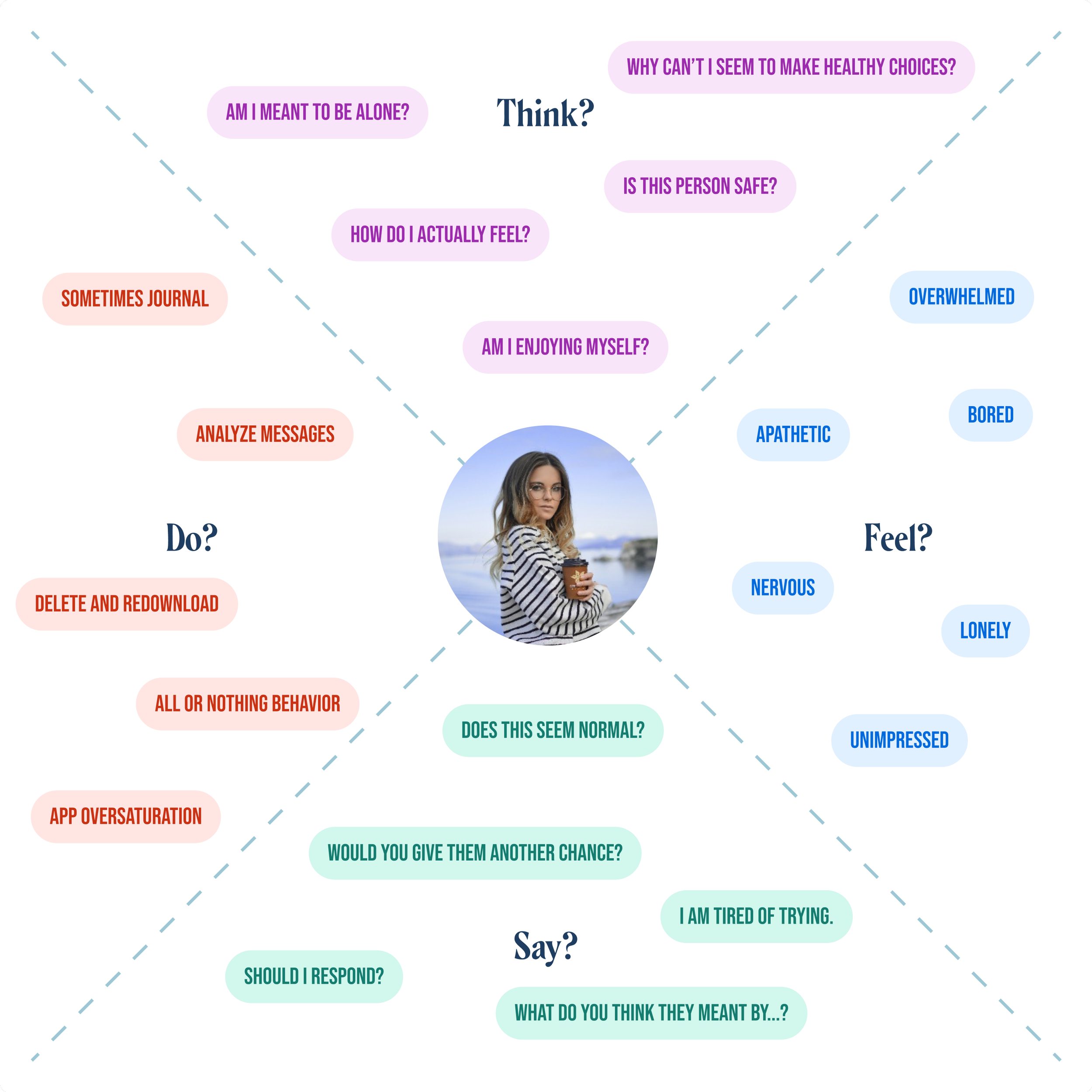
To gain more insight about our target users, we conducted 6 user interviews with women aged 22-45 about their experiences with online dating. This helped me to design an empathy map for our users, which informed all subsequent decision making surrounding feature prioritization, brand development, and language.
User Interviews
“I often say I’m going to reflect and do things in a responsible way, but I always get too overwhelmed.”
User Flows
Working with the product manager, I used the insights from the interviews to solidify our initial user flows. These flows focused on the highest-priority app features based on the resounding user feelings of overwhelm, apathy, and nervousness.
By creating a prospect profile, the user will feel less apathy about their prospects. They will take more time to consider all of the significant parts of the person they are considering, thereby creating a small amount of emotional investment.
By logging a date, the user will feel less overwhelm and more clarity about their dating experience. Logging a date gives them a chance to honestly reflect on their feelings, leaving less room for second-guessing and over-analyzing.
By both creating a personal profile, prospect profiles and logging dates, Clara will begin to provide them with insights on the types of people, the apps, and dates that are most successful for them. This will reduce feelings of nervousness and increase feelings of confidence.
Usability tests
After the user flows were polished, I got to work on creating a low-fidelity MVP. I knew it was not only crucial to test our hypotheses in real time, but for the founder to see the app’s foundation stripped of the bells and whistles. This would help us to have a conversation about what was really driving excitement (and eventually retention), as well as how we should speak to/about our users.
Over the course of 8 interactive usability tests, I was able to gain more clarity on the app’s tone, structure, and architecture.
visual design: maintaining the design intent
Now that we understood the primary flows, it was time to refine the visual identify of the app to be more accessible, modern, and appealing. After an initial conversation with the founder digging through through the Adobe files, it was clear that we had a long way to go in a short amount of time.
The original files showcased a variety of feature sets that relied heavily on sports metaphors, extreme color usage, and an overload of information related to your dates, prospects, and reflections. While I knew there was a pressing need for focus and simplification, I also knew there would be a process of education and trust-building with the founder, because she loved many aspects of the designs.
Every good designer knows trust is key before hard truths, so I spent some time digesting the screens and her vision for the app’s visual identity and future development.
old designs
The theme was “really popular” and inspired by Euphoria
The fun colors and layouts inspire people to take screenshots and share on social media
Appreciates that it’s not sparse or stark
Gamification is key - takes inspiration from the FIFA world cup, sports metaphors
The idea of clarity/getting clear - organic shapes and gradients drive the “getting into focus” metaphor
Brings levity and play to the dating experience
The primary concerns I had with the original designs were layering white text on gradient backgrounds, information overload, and lack of focus. The design solution would solve these usability concerns, while staying true to the things the founder really loved.
visual design: ideations & iterations
First, I audited the original designs for all of the component types I would need to consider in the UI kit. This included forms, cards, accents, and iconography style. Next, I started pitching and refining.
I focused on the most common screen structures, and added more screen types each cycle as we got closer and closer to a strong visual voice.
home page
Design solutions:
By softening the shapes and leaning into the “clarity” metaphor, I created a splash screen with strong narrative and intentional tone
pre-survey screens
Design solutions:
In user testing, the gamified language (ie, “prospect”) sometimes left a disconnect for users. Because the founder felt strongly about the language, I focused on user education and intentional friction in my redesigns, like adding the time indicator. This helped to explain what they were doing, why they were doing it, and that it would require some presence and investment.
home screen
Design solutions:
I maintained the pops of color throughout the app, but in an intentional way (specific color gradients signaling key features (blue/green = prospects, pink/orange = dates). Additionally, adding a stronger visual hierarchy and meaningful content encourages people to screenshot. We also added a screenshot share prompt to encourage social media sharing.
visual design: rapid fire questions
One of the primary features of the app is the rapid fire questions. This set of questions encourage the user to trust their gut instincts about a person without too much rationalizing.
Initially, the rapid fire questions were built in with a sports metaphor in mind, referencing the “relationship stage.” This, along with badges, made screen hard to understand and decreased user confidence - making it difficult to trust your gut.
By removing the metaphor, reducing the number of clicks, and eliminating noise, the feature intention was much more clear - leading to a more confident interaction.
Our goal was to deliver an iOS ready app that was usable by November 1st, which we more than accomplished. Since the app’s launch, Clara for Daters has seen numerous successes.
The app has seen a 37% 90-day retention rate as of March 2024, and has been adopted by leading professionals in the Matchmaking field as a primary client communication tool.
deliver: product launch
“The app is easy to use and asks specific questions that allow you to be honest with yourself about your dating life. I’d give it 10 stars if I could.”
- App store review
“Fantastic idea for an app and supremely well-executed on initial roll out. Can't wait to see how it's improved in the future as well”
- App store review
Reflection
While I have since moved on to other roles (and other designers have picked up where I left off), being the founding designer for Clara has been one of my favorites. Having that kind of intimacy from a product’s infancy to launch allowed me to explore and refine all of my design muscles.
(I can also confidently say my dating muscles suck a little bit less)


